Welcome back! We'll unpack what a logo should cost — and why the cheapest option bills twice. ⚠️
| Quick answer: logo prices span from R1,300 basics to full identity work; the cheapest option often bills twice — once to fix it. |
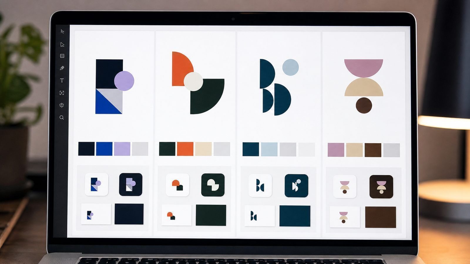
A logo costs R450 or R15,000, and the difference is not drawing time 🎨. It is thinking, testing, files and rights. The awkward part is that the cheap logo looks fine on the screen where you buy it — and fails in the two places you will actually use it: a small profile picture and a large vehicle sign.
What Each Price Buys
| Price band | What you receive | The catch |
|---|---|---|
| R300 – R800 | Online template or quick edit | Used by thousands; usually no vector file |
| R800 – R2,000 | One concept, two revisions, image files | Check whether print-ready files are included |
| R1,300 – R6,000 | Custom concepts, revisions, full file pack | Confirm ownership in writing |
| R12,000+ | Identity system with guidelines | Only worth it once you use many surfaces |
The Hidden Bill on a Cheap Logo 🧾
- Reprinting signage, packaging and uniforms when the mark fails
- Paying again for a vector file the printer requires
- Meeting your own logo on a competitor’s van
- Redesigning within two years — paying twice for one job
How to Judge Any Quote 🧩
Ask what files arrive, who owns the artwork, how many revision rounds are included, and whether sizes for print and social are supplied. Then look at the mark in black and white at thumbnail size. If it still reads clearly, it will survive everywhere. If it needs colour and size to work, it is not finished.

What a Logo Cannot Fix
A logo will not rescue a business with unclear prices, slow replies or a confusing offer. It improves recognition, credibility and consistency — real gains, but only once the basics are in order. The most common disappointment in this category comes from businesses that commissioned a beautiful mark and changed nothing else, then wondered why nothing changed.
Use it well and the effect compounds: the same mark on the invoice, the van, the quote and the profile picture tells customers they are dealing with one organised business. That consistency is what people actually mean when they say a brand looks professional.
When to Redesign
Redesign when the mark genuinely fails three tests: it does not reproduce well small, it cannot be used in one colour, or it no longer represents what the business has become. Wanting a fresh look is not on that list — businesses that redesign out of boredom spend repeatedly and confuse the recognition they already earned.
If you do redesign, keep one element of continuity — a colour, a shape, a letterform — so existing customers recognise the change as evolution rather than as a new company they do not know.
How to Brief So You Pay Once
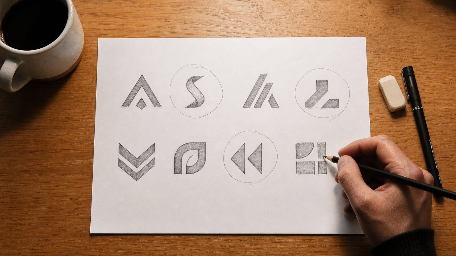
A good brief costs you thirty minutes and saves a redesign. Write the business name and what it does. List five words that describe how it should feel — and five it must not. Name three colours you like and three you cannot use. Mention where the logo will appear most: a van, packaging, a website, uniforms. Attach anything customers already recognise: a nickname, a shape, a symbol from your signboard.
Then name your audience honestly. A logo for teenage sneaker buyers and a logo for retired farming clients are different jobs, and a designer who knows which one is being asked for will not waste a week drawing for the other. Briefing badly and revising endlessly is the most expensive way to buy design.
Four Ways Owners Overspend
| Mistake | What it costs |
|---|---|
| Redesigning within two years | The full design fee, paid twice |
| Buying files the printer cannot use | Reprinting, or paying again to convert |
| Choosing the mark by committee vote | Months of revisions and a diluted result |
| Copying a global brand closely | Legal risk and no distinctiveness |
None of these is about the artist’s rate. They are about decisions made after the invoice — which is why the cheapest logo is often the second one a business commissions.
Test Before You Print
Before you commit to a design, run it through four cheap tests. Shrink it to 40 pixels wide — can you still read the shape? Print it in black and white — did anything important disappear? Place it on a dark background — does it need a white outline that your versions do not include? Enlarge it to a metre wide — does it look confident or thin?
Then do the one test nobody enjoys: hold it next to the three competitors your customers also consider. If it is the vaguest of the four, the design is not finished, whatever the invoice says.
Four tests, twenty minutes, and every one of them is cheaper than reprinting a van, a signboard or a thousand labels.
| Bring this to the logo brief Three competitors you like and two you don’t. Where the logo lives first: signage, card or screen. One sentence on who the customer is. That single page saves a week of revisions. |
Frequently Asked Questions
Is a R500 logo ever a good idea?
For a side project, yes. For a business that will print, paint and print again, the file pack alone justifies more.
Do I need a trademark search?
Design and registration are separate. Search before you commit to printing if the mark matters to you.
Can I design my own? ✅
Plenty of owners do, with a designer’s help to finish the files. You will save money and keep the meaning.
Should I put the logo on the vehicle first?
Only after you own the print-ready vector files. Vehicle signage is one of the most expensive places to discover your logo cannot scale without looking soft.
Do I need different logos for different services?
Rarely. One strong mark with clear service names beside it keeps recognition working — multiple logos split attention you paid to gather.
A logo is doing a job either way — make it a good one. See logo and branding packs — from R1,300Get my free branding quotation |